![]()
These colours are the familiar standard settings for candlestick charts. You can change these candle colours individually in the "Chart Analysis" widget.
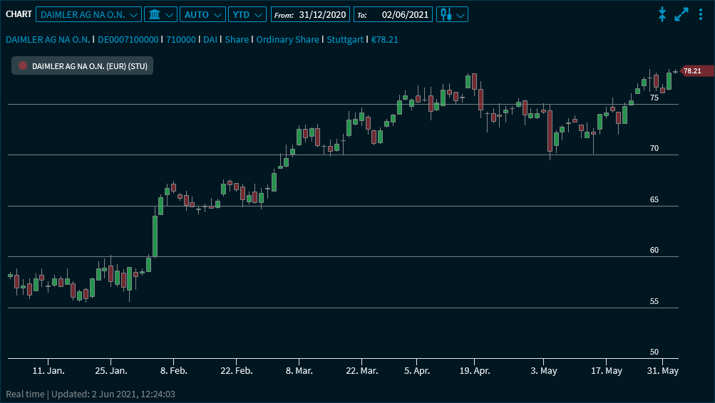
Point to the candles to show the corresponding values:
![]()
![]()
These colours are the familiar standard settings for candlestick charts. You can change these candle colours individually in the "Chart Analysis" widget.
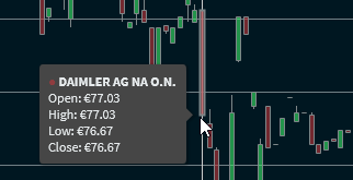
Point to the candles to show the corresponding values:
![]()