Economic Data - "Comparison chart" view: Bar chart
From the drop-down list in the upper part of the widget, select the "Comparison chart" view (default view when you open the widget). With this chart, you can compare economic data for up to 5 countries over a period that you can configure. In the second drop-down list, select the "Bar chart" view:
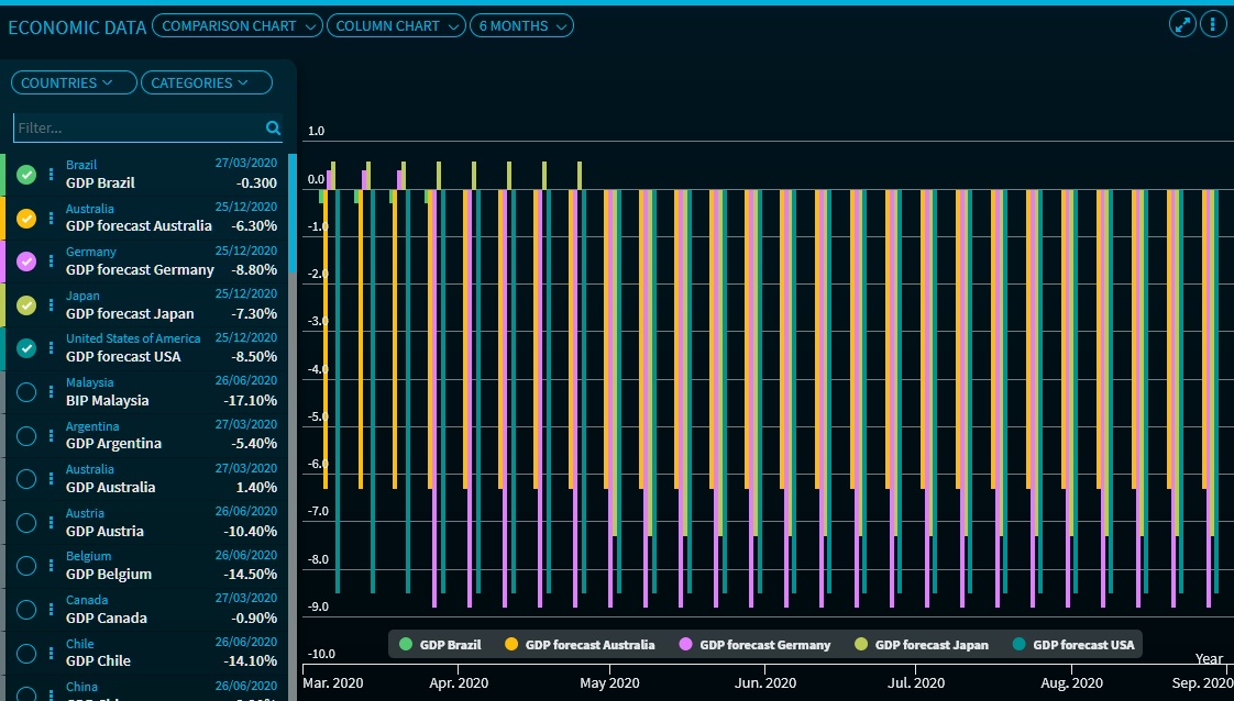
Point to the columns to display the associated data. You can use the legend entries to highlight the individual columns. For a description of the other functions and settings of the "Comparison chart" view of the widget, see Economic Data - Comparison chart" view:Economic Data - "Comparison chart" view: Line chartLine chart.