Economic Data - "Comparison chart" view: Line chart
From the drop-down list in the upper part of the widget, select the "Comparison chart" view (default view when you open the widget). With this chart, you can compare economic data for up to 5 countries over a period that you can configure.
With the second selection list, you can change the display from a line chart to a bar chart .
You can select the comparison period from the third drop-down list in the upper part of the widget.

The following periods are available:
- 1 month
- 6 months
- Year to date
- 1 year
- 3 years
- 5 years (default setting)
- 10 years
- Max.
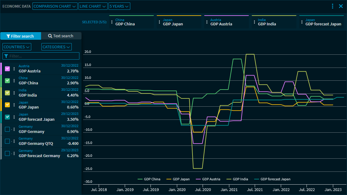
On the left side of the widget, use the filter and search to select the data to be displayed in the chart.
You can set the chart as follows:
Field | Description |
|---|---|
Select country | Select the countries from the first drop-down list in the "Filter search" area. To do this, select from the alphabetically sorted entries in the drop-down list or use the "Select all" command to show all countries in the configuration area. |
Select category | Select the category from the second drop-down list. To do this, select the corresponding entry from the "View" drop-down list. The following data is available:
|
Filter | Use this filter field to filter the entries currently shown in the configuration area. The filter applies as soon as you start typing. |
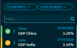
Selection buttons | You can show or hide the data displayed on the left side at any time. To do this, select the corresponding button next to the corresponding entry:
The selected entries move to the top of the list, which is initially sorted alphabetically. You can select up to 5 entries. If you have already selected 5 entries and want to select a different one, you first need to clear the selection of an entry. The colour of the entry corresponds to the colour of the corresponding chart line. The country, name, date of the last update and the value are shown for each entry. |
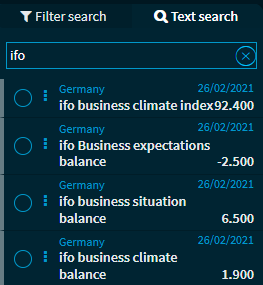
| Text search | Switch to this tab to search for products by entering specific terms in the search field.
Make your selection just as in the filter area. |
Menu icon | Use the menu icon in front of an entry to open the instrument as usual in another widget of your choice, such as in a "Full Quote" or a "Chart" widget. |
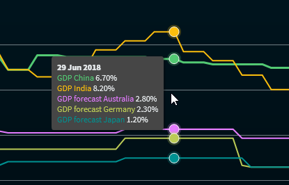
Chart | On the right side of the widget, you see the selected data for up to 5 chart lines. The colours corresponds to the colour of the corresponding selection button. Point to the chart line or the entries in the legend to view the exact price details:
|
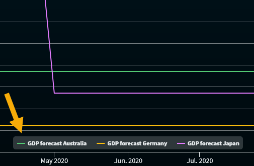
| Legend | A legend is displayed in the chart. If you point to a legend entry, this time series is highlighted in the chart. Click the legend entry to hide the corresponding time series (it remains dimmed out in the legend and can be displayed at any time by clicking it again).
In this example, the data series "BIP Prognose Deutsch" above the legend is hidden. |