Certificate Comparison – Chart
In the drop-down list at the top, select the "Chart" view to display the certificates as time series in a chart:
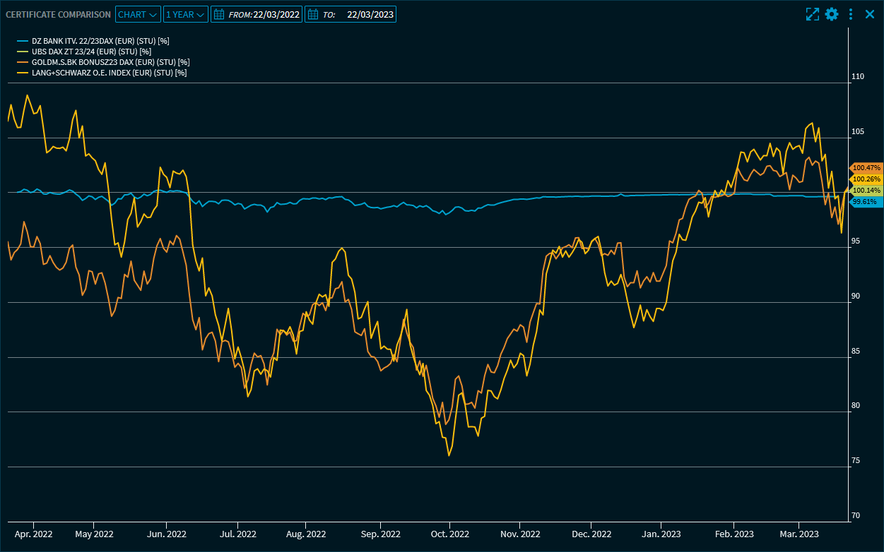
"1 year" is set by default, showing the performance of the certificates over the last 12 months. The 100 line corresponds to the level one year ago.

Point to the time series to show the price information for a particular date. Depending on the current settings of the widget, these are then displayed on the chart lines as a tooltip or, as here, in the legend.
The second drop-down list at the top allows you to change the period of the chart. The following periods are available:
- 3 days
- 1 week
- 1 month
- 6 months
- Year to date
- 1 year
- 3 years
- 5 years
- 10 years
Max. (all available data since the oldest certificate issued)
In addition, you can set a custom time period using the integrated calendars in the "Date from:" and "Date to:" input fields.
Click a security name in the legend to show or hide its time series.
By using the widget's menu icon, you can export the charts in the "Certificate Comparison" widget to various file formats. For more information about working with charts, see Chart.