Chart
The "Chart" widget is a modern chart analysis tool allowing you to intuitively provide the most important functions and views. The charts automatically adjust to the individual security types.
Use the following chart types for your analysis:
- Line chart
- Mountain chart
- OHLC chart
- Candlestick chart
The "Chart Analysis" widget also provides additional chart types.
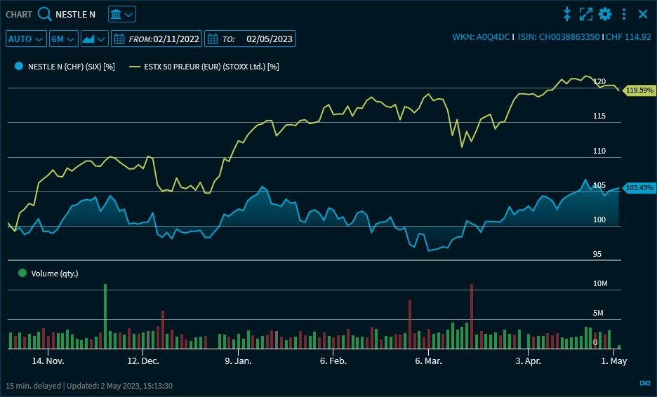
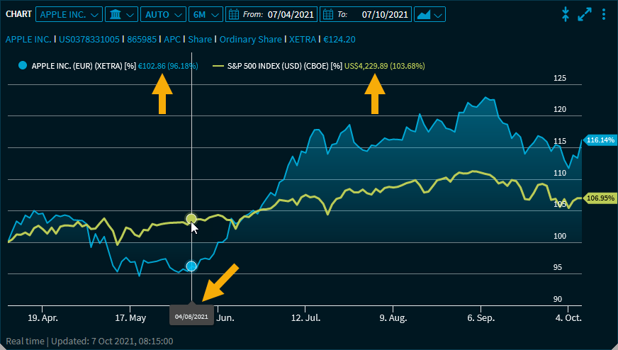
You can also display revenues, benchmarks or the moving average and modify the analysis period.
The aggregation of the charts takes place automatically depending on the set period:
- Intraday charts (1 hour to 14 days): Aggregation minutes
- Charts from 3 weeks to 5 years: Aggregation days
- Charts longer than 5 years: Aggregation weeks
The "Chart Analysis" widget also offers additional chart types and many other technical indicators.
Point to the chart lines to show the price information for a particular time.
The date is shown on the time axis, the respective price is shown in the legend. In the settings of the widget, this display can be changed to "Tooltip".
If you have shown the volume, then the number of units is shown there when you point the mouse at the chart lines.
In addition to the Standard elements, the "Chart" widget has the following elements and functions:
Element | Description |
|---|---|
Select security |
The selection in the upper left corner of the widget shows the name of the security currently displayed in the chart. Open the menu to select a security. In addition to using the securities search field, you can also select from the previously selected instruments below the search field. |
Select trading venue |
You find the trading venue drop-down list next to the security drop-down list. Select the trading venue. |
| Select setting y-axis |
To the right of the trading venue drop-down list, you can set the y-axis. Select between "Relative", "Absolute" and "Auto". With the "Auto" setting, the optimal configuration is set automatically. |
"Period" drop-down list |
In the next drop-down list, you will find various predefined periods. Depending on the trading venue, you can select from the following periods:
You can set a custom time period using the integrated calendars in the "From:" and "To:" input fields. You can also configure and save multiple custom time periods via the Chart widget settings . These will then appear here at the bottom of the drop-down list.
If a "Chart" widget with the "1 day" setting is in a group of widgets, then the view of a fund is automatically set to 3 days. If the fund is then set to another security type in one of the grouped widgets, then the period is also reset to "1 day" in the chart. |
Select chart type |
Select the corresponding type to be displayed:
For more information about the individual types, see Chart type. |
Icon “Copy chart to clipboard" | Click this Icon to copy the chart to the clipboard. |
x-axis | The x-axis shows the time scale of the currently set period. |
y-axis | The y-axis shows the price scale. If you specified a benchmark, then a percentage scale is shown for better comparison ("Auto" setting). Displayed values also have a percentage sign when displayed as percentages:
By using the Widget settings, you can also display the values of the y-axis (ordinate) outside the chart.
For derivatives, two absolute axes are displayed by default for the instrument and the associated underlying. This means that, for example, any barriers or caps that may be present can also be displayed correctly.
|
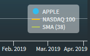
Legend | In the legend displayed in the lower right corner of the widget, you see which chart lines are associated with which security or indicator.
(In this example, "SMA (200)" is the indicator "Moving average on 200 day basis", "TECDAX" is the benchmark.) You can remove displayed benchmarks or indicators from the legend: Point to the legend entry you want to remove. This displays a remove icon behind it, which you can use to quickly remove this chart line.
You can show or hide the legend by using the Settings. |
| Security-specific properties | The display of security-specific properties such as barriers for certificates (with the "Absolute" setting for y-axis) is integrated. Example of an automatically plotted barrier 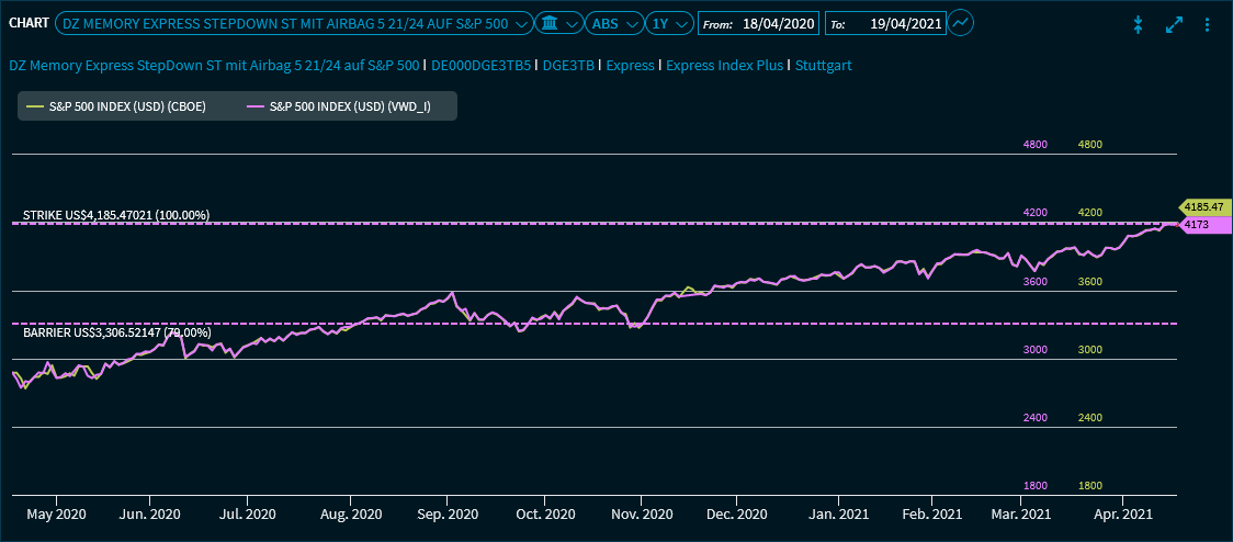 |


In the Widget Gallery, you find the "Chart" widget for all security types in the corresponding "Defaults" section.