Risk-Return Matrix
With the "Risk-Return Matrix" widget, you can visually compare the volatility and performance of securities within an asset class over various periods. On the horizontal axis, you see the volatility in percent. On the vertical axis, you see the performance in percent.
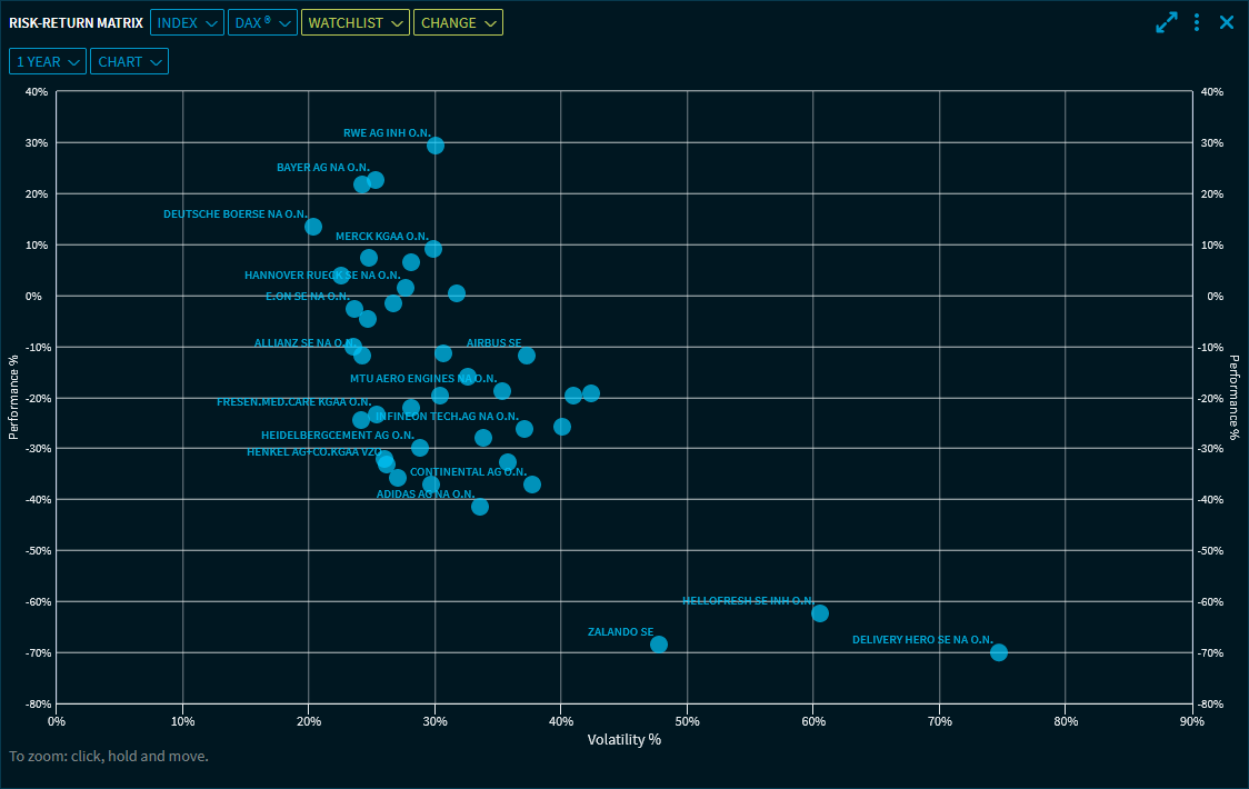
From the first drop-down list at the top of the widget, select if you want to show the securities of an index, a watchlist or a portfolio. From the second drop-down list, select the actual index, watchlist or portfolio.
Optionally, select from the third and fourth drop-down list additional indices (or watchlists or portfolios) to show their securities in the same chart. For example, you can compare securities in a portfolio with those in a watchlist, and so on.
Point to a point on the chart to see details (name, WKN, exact values, and current price) for this value.
If you have a large number of data points, use the zoom function to enlarge an area of the matrix.
By using the Settings of the widget, you can show the mean value of the securities, for example, for the securities in the "DAX" index, you can also show the DAX. This is then displayed in a different colour:

To remove shown lists from the display, click again in the list and select the "Clear" command at the top of the list:

In the drop-down lists below, you define the analysis period and the "Chart" or "Table" view). You can select from the following periods:
- 1 month
- 3 months
- 6 months
- 1 year (default setting)
- 3 years
- 5 years
- 10 years
Year to date
In the Widget Gallery, you can find the "Risk-Return Matrix" widget in the "Other" section of the widgets for shares.
In a Watchlist or a Portfolio, you can also select a view of this type.