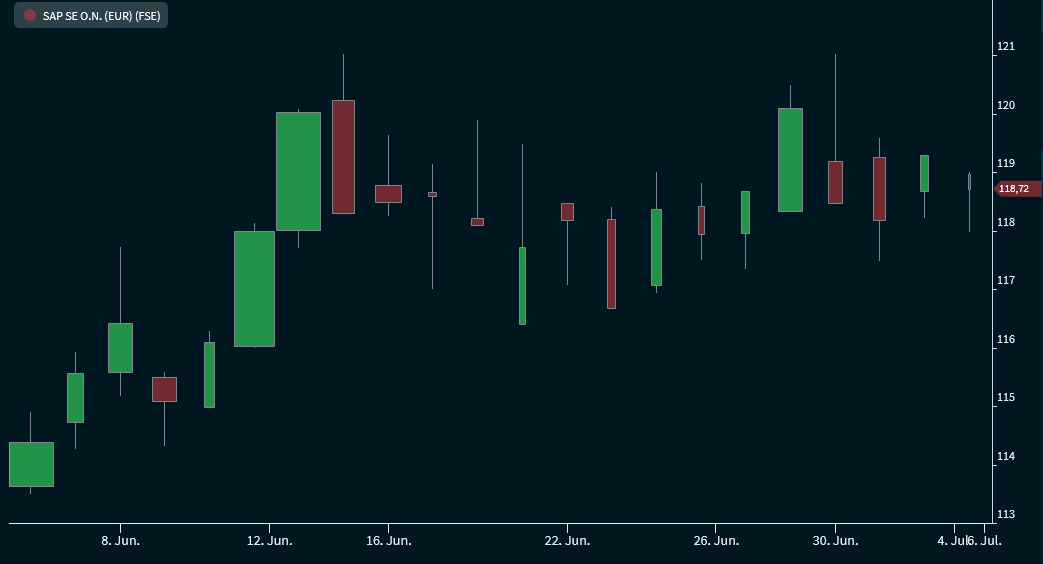
The "Candle volume" chart type shows, similar to OHLC - or Candlestick chart, the high, low, opening and closing prices. In to the high, low, and close, the colour of the candles shows if the daily close is listed above or below the daily open. If the close is above the open, the rectangle is shown in green (default setting); if it is below the open, it is shown in red. In addition to the candlestick chart, you can see the volume here by the width of the candles.
These colours are the familiar standard settings for candlestick and candle volume charts. You can change these candle colours individually in the "Chart Analysis" widget.
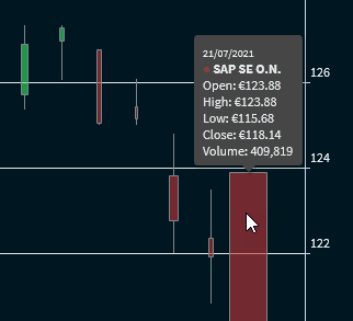
Point to the volume candles to show the corresponding values:
To switch to this chart type, select the "Candle volume" entry from the drop-down list.
JavaScript errors detected
Please note, these errors can depend on your browser setup.
If this problem persists, please contact our support.