Settings on the "View" tab

In the "Chart Analysis" widget, switch to the "View" tab to configure the chart display.
You can find the following settings:
Element | Description |
|---|---|
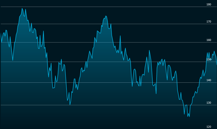
Ordinate | Use this drop-down list to specify how to display the y-axis of the chart. The following entries are available:
|
| Aggregation | The aggregation of the charts takes place automatically depending on the set period:
Use this drop-down list to select how to aggregate the displayed price data. The display is automatically optimised by default. (In this case, you will see the automatically set aggregation period in brackets behind it, for example, "Automatic (1 day)"). Depending on the selected period, you can use this selection list to select further entries:
|
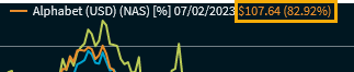
| Legend | Turn this switch to the left to hide the legend displayed by default at the bottom right of the chart. When you point to a chart line, the date and price at that point are shown in the legend:
This display can be changed in the widget settings so that the price display is shown directly at the mouse pointer via tooltip. |
| Push | Turn this switch to the right to enable the data push feed. |
| Last closing price | Turn this switch to the right to show the tooltips. |
| Navigation pane | Turn this switch to the right to right to display the lower navigator (zoom bar). |
| BVI performance | Move this switch to the right to change the display in the chart window to BVI performance. If this setting is turned on, a further switch appears below it, which you can use to specify whether the original line of the performance is 100 or 0. The display of the BVI performance appears - depending on the selected setting - behind the corresponding legend entry or directly in the tooltip at the mouse pointer.
|
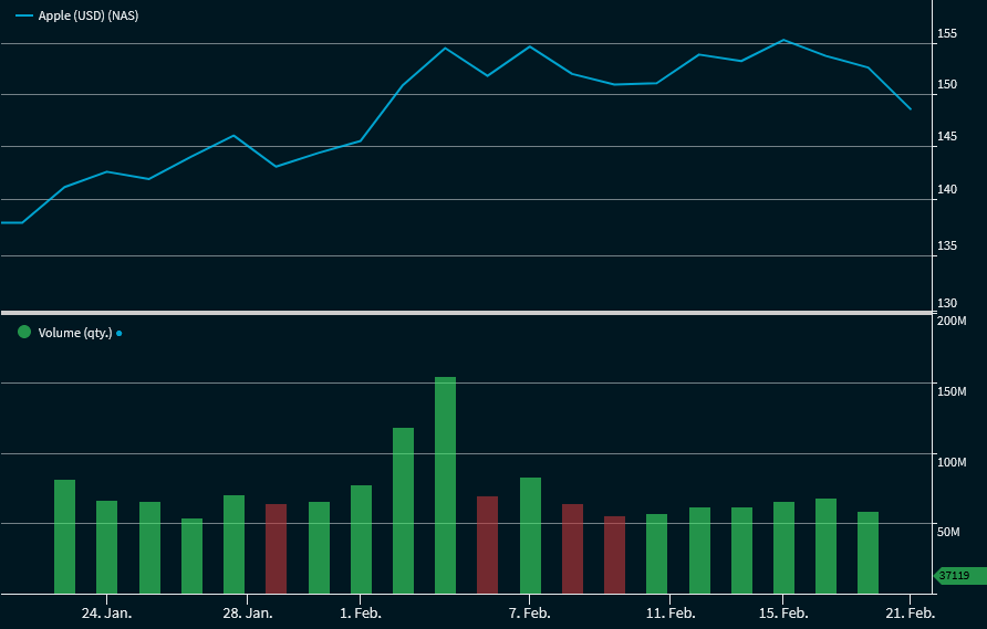
| Volume | Turn this switch to the right to show the volumes. This indicator shows the volumes at the corresponding times as bars of a histogram. The volumes are green for rising prices and red for falling prices. Example: Chart with displayed volume
|
| Display last value | By default, the last values are displayed at the right side. Turn this switch to the left to hide them. |