Display charts for selected key figures
Use the selection fields on the left side of each table in the "Company Data" widget to select up to 3 different key figures. If you have selected at least one entry, you can display a graphical representation of the selected key figures by using the "Chart" button that is then visible in the header of the widget.
To edit key figures as charts:
- Enable the the selection fields of the relevant key figure(s).
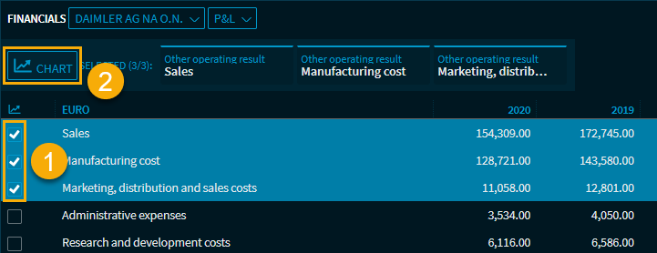
Then click the now visible "Chart" button.
This displays the chart with the selected key figures in the widget.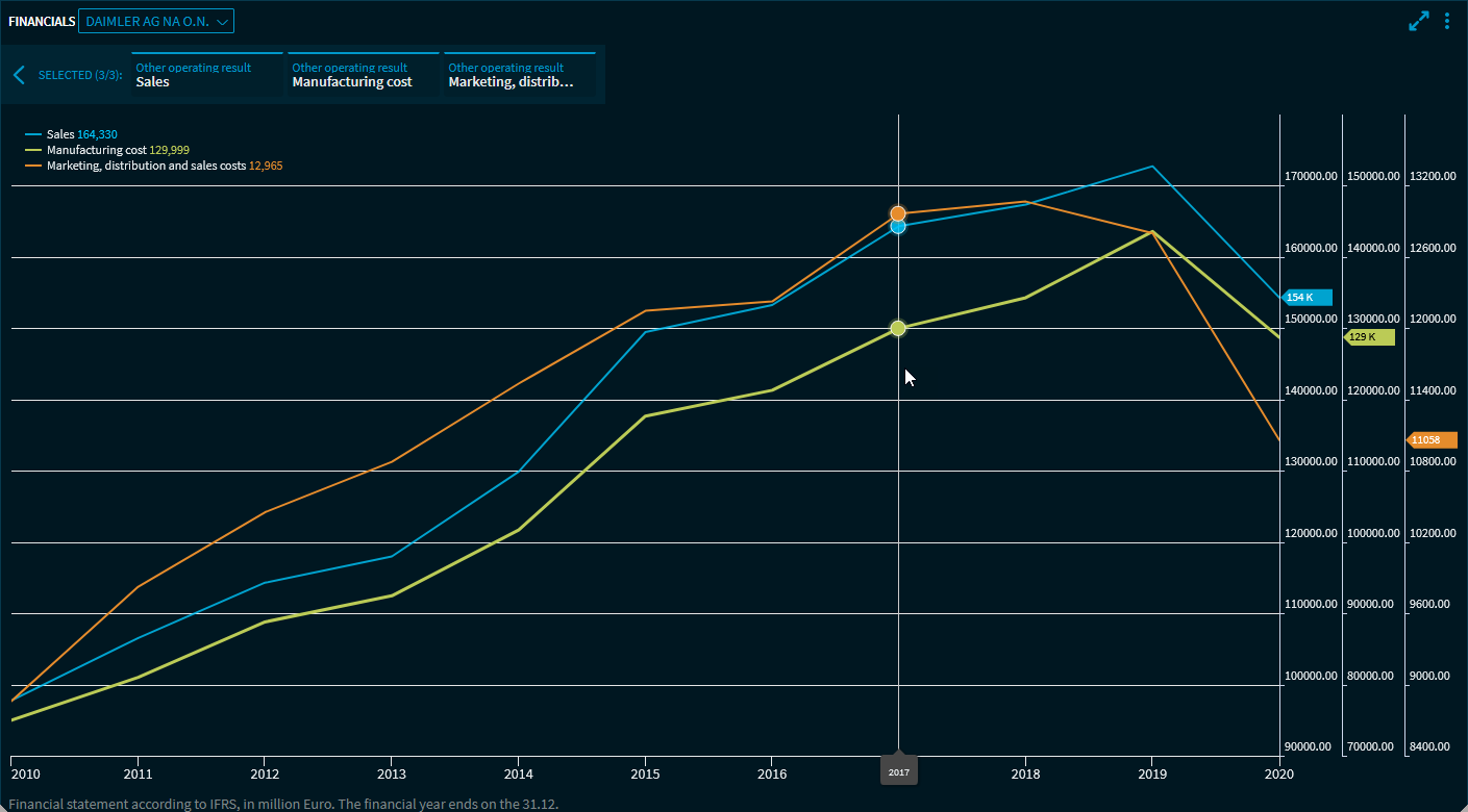
On the right side of the header, you can see the currently selected key figures. You can also disable them here (as an alternative to disabling them in the table) by using the close cross that appears when you point with the mouse.Use the "Close" button to close the chart display and return to the standard view.
Notes on charts
- On the x-axis, you can see the years
- Each selected key figure has its own y-axis
- The legend can be moved
- A vertical line cursor shows the data for the position in the legend