"Chart Gallery" view (portfolio)
Select the "Chart Gallery" view from the view drop-down list to display the securities in the portfolio as individual charts in a Chart Gallery.
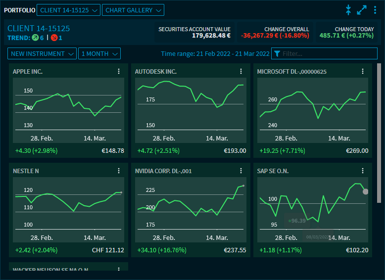
In the Chart Gallery, you can see the chart for each security of the portfolio, including security name, price and absolute and percentage price development over the period. Charts of securities with positive price development are shown in green, those with negative price development in red.
By using the drop-down lists and clicking the "Instrument search" icon above the Chart Gallery, you have the usual option of adding instruments or selecting the time period.
![]()
For each security, the familiar widget menu is available at the top right of the individual chart for further navigation.
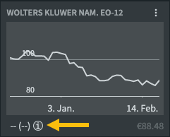
If the currently selected time interval is not completely available for a security in the Chart Gallery (for example, for newly issued securities), the chart appears dimmed. A corresponding info icon then appears under the chart, the text "Available quote history differs from requested period" is displayed when pointing to the icon:
By using the Widget settings, you can also make further configurations for this view, for example, show details on the securities.
Example: Show details of the securities
